
This post is also available in: Français (French)
Twitter charts
Since the launch of Twitter Analytics in 2014, people went crazy. Everyone became obsessed with data and everyone did their best to improve their twitter account according to that information. The tool kept upgrading every now and then until it reached the progress we’ve got today. Analytics came as a way to create more transparency and help Twitter users figure out what’s making their account tic. It helped give more insights on their account and help them work a strategy that oriented them to success. But there’s something still missing. As you see, nowadays, we prefer to see the data rather than having countless lines of text explaining something. That is why Twitter data charts (aka Twitter chart) are so important.
This happens with scrolling magazines, as well. We are visual creatures, we love images, colors, and videos more than text. That’s why every time we check magazines, we only take a look at pictures instead of reading the texts. This does not only happen with magazines, but it happens as well with Twitter data. Stats need to be reflected in good-looking charts in order for people to understand them. That is exactly what happens with Tweet Binder’s reports. Our charts show data from Twitter in a way that is very easy to understand. Imagine having all these charts for your Twitter chats!
But, before we take a look at our charts and how they’re helpful, we’ll take a dive in the Twitter Analytics world to understand what some concepts mean.
Twitter analytics data charts
You probable already know what Twitter analytics are. But, do you realize any of what those words mean when you take a look at them? Do you understand how to track your activity? What does your reach mean? What do your Twitter impressions mean? And so on. Twitter Analytics might offer you some basic metrics to help you with your account, but if you don’t understand them, you wouldn’t be able to do anything.
If you want to access your Twitter Analytics then you can simply go to your account, and clicking “analytics” in the dropdown menu.When you log in to Twitter analytics you can expect to see tweets, top tweets, impressions, engagements, engagement rates, clicks and much more.
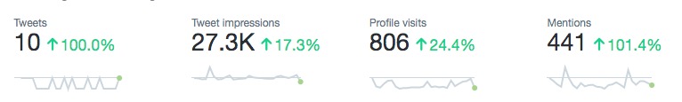
Twitter analytics
Are you familiar with the Twitter engagement? If you don’t know what’s twitter engagement, then you’re at the right place. Twitter Engagement is simply how many retweets, replies, click-throughs your tweets get. So, next time you see how many engagements you’ve got, remember that it sums up all the click-throughs, replies, favorites, and so on that your twitter has got. Your engagement rate is your engagements divided by the number of impressions you’ve got on that tweet.
Twitter impressions are how many times your tweet actually appeared on the user’s timelines. It includes those who follow you and even those who don’t follow you. Impressions don’t includes how many favorites you’ve got or how many click-throughs, it only involves how many people have seen your tweet.
Twitter reach is a term that you’ll come across often when analyzing your data. And it’s completely different than an impression and they should not be used interchangeably. While impressions are about how many people have seen your tweets, reach is used to express the potential of your tweet. That is why reach is always higher than impressions.
Chart data from Twitter
Twitter analytics give us some charts where we can see some basic stats. these charts are basically time graphs where we can see the evolution of some parameters. For example, we can see chart data Twitter with the number of mentions we have received. Or the twitter followers chart with the amount we have gained (kind of a Twitter follower tracker). These Twitter data charts are really useful but they are not enough. It is necessary to dig deeper and count with an external tool to get more Twitter data charts.
Are Twitter Analytics Enough?
Well, if you’re a business that’s getting all traffic from Twitter, Twitter Analytics are not be enough for you, but if it’s your personal account or something that you’re doing just for fun, then it’ll be okay. Why wouldn’t it be enough for you if you’re a business? Simply because Twitter Analytics offers some very basic tools that wouldn’t help you accelerate your account’s growth all that much. It’ll help you understand the basics, but the psychological pattern of your followers would be hard to grasp.
Plus, Twitter analytics are quite boring and don’t look that much interesting. And as we said before, we’re visual creatures and good-looking charts will pick up our attention whether we like it or not. That is why so many tools have been created to fully diagnose your twitter account, including ours “Tweet Binder”.
Tweet Binder’s Chart data Twitter
Tweet binder is simply a developed analytics tool that will help you view and discover the activity lurking behind your hashtags, keywords, user for free. Although we’ve got a free plan, we have paid plans as well that will give you more thorough data that will help you understand your account, campaigns, hashtags and so on. With our Tweet Binder’s reports, you’ll be able to understand how easy it is to analyze the data that’s lurking behind some twitter trends.
Charts with stats from Twitter
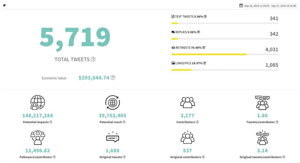
The reports have a first chart that displays the general stats about the hashtag or term that is being analyzed. It includes the total number of tweets, the impact of tweets and the total Twitter impressions and tweet reach. In more detail, this chart will help you understand your potential impact and potential reach. Potential impact includes how many people could have retweeted, clicked-through, or replied to your tweets.
This will help you realize the potential of that hashtag and what are the things you should be working on to realize that “potential”. It also helps you find out how many people contributed to it. You can also find out the original contributors to the trend, the original tweets, and how many people followed that trend overall. And if it’s enough, then you get more insight on the value of that hashtag or term.
Twitter user rankings
The report also includes up to 12 user rankings. With these user rankings, the client can easily know which users have had the highest impact on the analysis. They can help to detect brand ambassadors and influencers. This chart will help you find out the original contributors to the trend and the ones who had impacted it tremendously. This will help you realize the power these people have and how they mobilized a whole trend with only a couple of tweets.
You can also find out the kind of tweets that made people retweet them that much so you can figure out how to use that to your advantage as well. If you find out what made people like those tweets, then you can copy that and use it your advantage.
These are some of the chart data twitter that you can get from a Tweet Binder report:
- Most mentioned users
- Most retweeted users
- The most liked users
- Top engagers by like
- Top engagers by retweet
- Certified users
- Top photographers
- Highest impact
- Most popular
- Most active
- Retweeters
- Original tweets
These Twitter data charts will give you a thorough analysis of what the hashtag and the users are about.
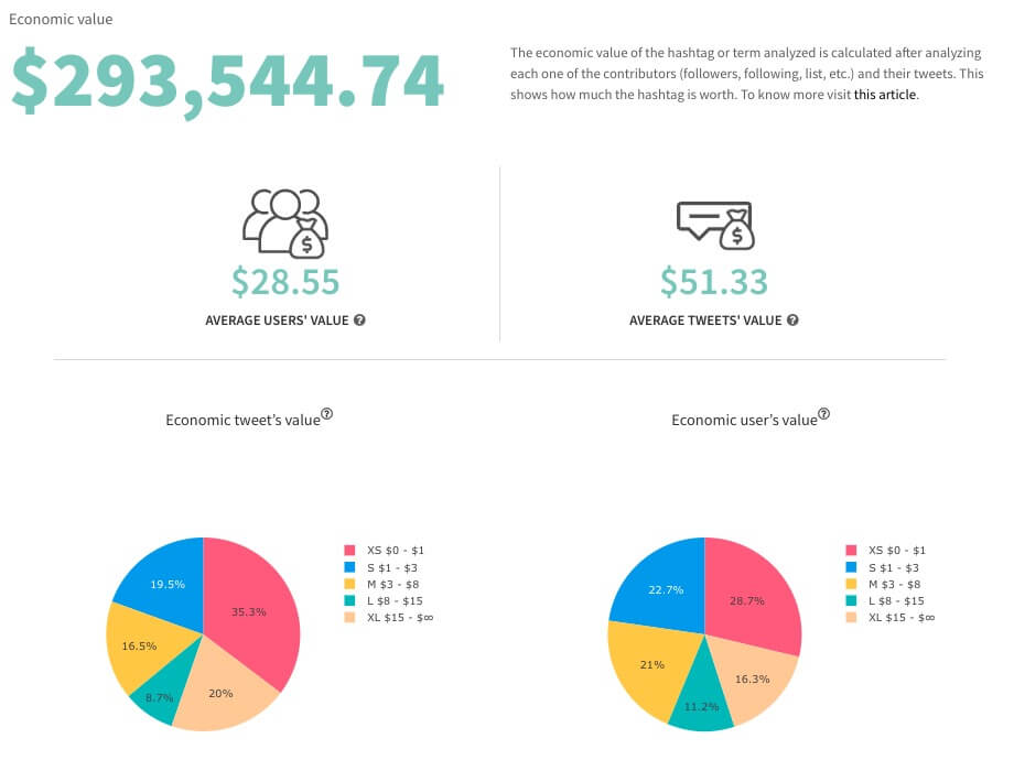
Chart to see how much a hashtag is worth
These charts display a metric developed and owned by Tweet Binder. The first chart shows the economic value of the analyzed hashtag. This number stands for the amount of money someone should have had to spend in the market in order to get the obtained number of tweets with the obtained number of Twitter impressions.
There are also charts with the distribution of the value of the tweets inside the report and with the value of the users that have participated in the report. This way, you’ll be able to understand the power of tweets and how much they’re valued with simple retweets and favorites from users. It’ll also help you figure out how much influencers impact the hashtag or tweet’s value by simply retweeting it or talking about.
With this chart, you’ll be able to understand what are some users worth and how much they would’ve cost you and how they would’ve impacted your campaign tremendously with their retweets. So, this is kind of a top Twitter account detector. Here is an example below:
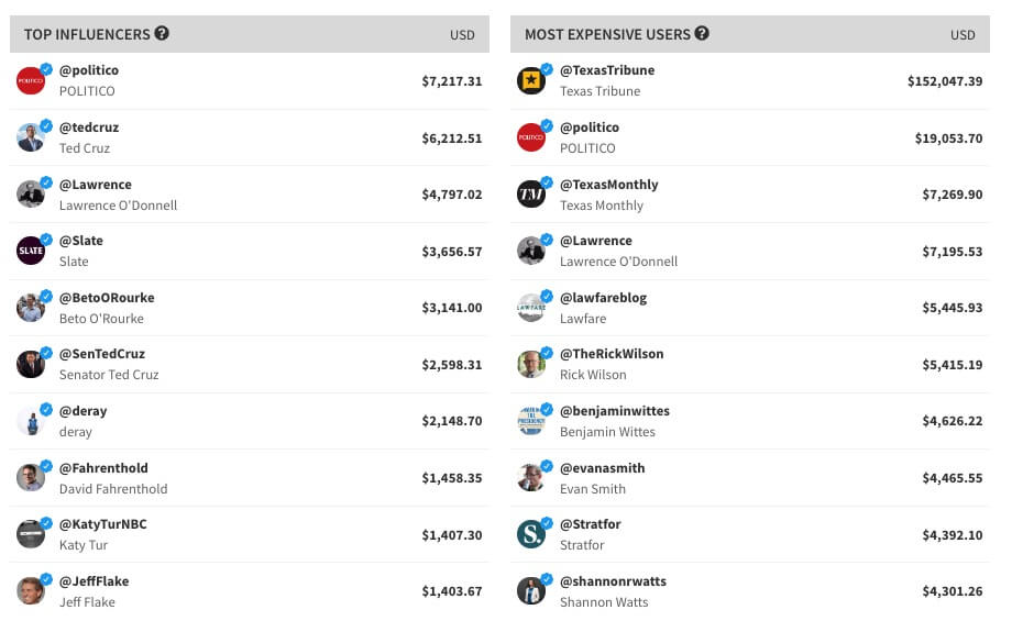
If you need help from SenTedCruz with the hashtag it would’ve probably cost you $2,598.31.
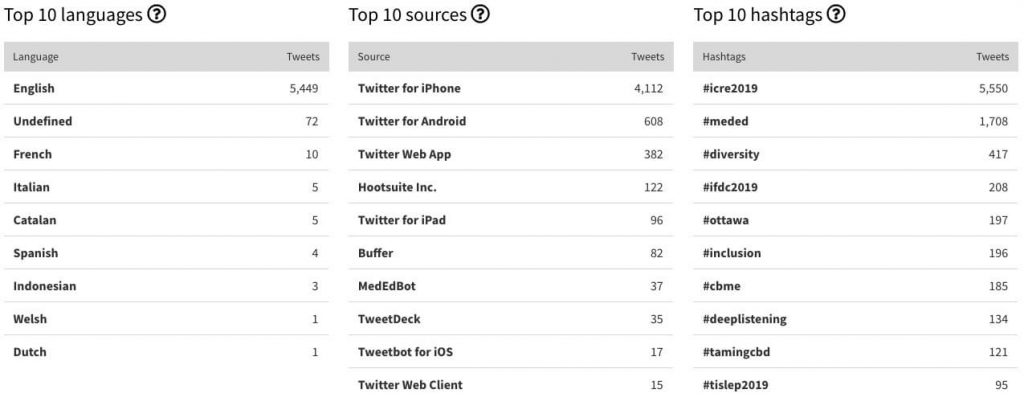
General Twitter charts
Finally, the report includes charts on the most used languages, sources, and hashtags. This information is really valuable because it can help to understand the audience better. Knowing the hashtags your audience uses along with the one you analyze can give you ideas on what they think as well as about which thing they relate with your hashtag.
It’ll also help you figure out the top 10 languages that people use to communicate within that hashtag so you know the origins of the contributors. If the main language is English then it’ll be easier for you to use the hashtag, but if it was Japanese then it’ll be another story. Finding out the sources, languages and related trending hashtags will help you tremendously in realizing the origins of people, their cultures and how to impact them in a future run.
Twitter sentiment charts
Tweet Binder’s private suite includes charts on sentiment analytics. We have noticed that Twitter sentiment analysis is very important for our clients. tHat is why when purchasing a Tweet Binder PRO report you get the analysis of the sentiment of the tweets. This means that you will get to know how positive or how negative your report has been.
Learn how to read charts data twitter
Twitter Analytics combined with Tweet Binder will help you get more insights about your business in no time and easily. It will help you figure out what to talk about, what hashtags to use, and what kind of niche you’re walking in. Using this data and this information will help you learn how to promote your account and even become a marketer in the long run. So, learn how to use it!
It is important to notice that you will also get these Twitter charts by running a report with the Twitter Advanced search commands. These are very useful and you should definitely try them.

Javier is the founder and CEO at TweetBinder. With more than 10 years of experience in Twitter Analytics space, he is on the mission to build best-in-class Twitter marketing tools helping X community to thrive.